

A Game Changer For Landlords
9 years ago | 4 comments

This time last week we unveiled a fresh Property118 website design and new functionality to improve Navigation, searching and the general user experience.
One of the new features we have added is a ‘hover-over’ function which appears when your mouse cursor is placed over a members name or Avatar. The date of when the member joined Property118 and how many comments they have posted to date is then displayed. We think this will be particularly useful to established members who like to report inappropriate comments. Sadly, some people join forums and post antagonistic comments to wind people up. For some reason they get a kick out of it! Where such comments are reported a view is then taken by moderators on whether to remove the offending comment, and in extreme cases to expel the member and block their IP address so that they are unable to create a membership profile using an different name and email account.
Inevitably there were a few initial ‘bug-fixes’ to deal with when we first launched the new website and we are extremely grateful to members who took the time and effort to point these out to us. Hopefully, these have now all been resolved. We hope you will agree that the text font is now much easier to read for example, and to make bigger for those with less than 20:20 vision. Other fixes were to ensure that comment links pointed directly to the associated comment as opposed to the article and that login issues were resolved. We are still working on some image cropping issues.
There may still be things you spot which are slightly annoying or could be improved upon further, hence we would very much like you to tell us what these are.
Please leave comments below and rest assured that we take all user feedback very seriously and will do whatever we can to continue to improve your user experience.
Daily Newsletters were paused whilst we were ‘bug-fixing’ but will now resume for those who were previously receiving them and for all new members.
Thanks in advance for your help.
Neil Patterson – Managing Director of Property118 Limited
Every day, landlords who want to influence policy and share real-world experience add their voice here. Your perspective helps keep the debate balanced.
Not a member yet? Join In Seconds
Login with
Previous Article
Shelter and their abandonment of social tenantsNext Article
HMRC Internal Manuals - Landlord Incorporation
9 years ago | 4 comments

9 years ago | 2 comments
Member Since January 2011 - Comments: 12230 - Articles: 1440
1:56 PM, 7th August 2017, About 9 years ago
This is what it should look like on all Desktops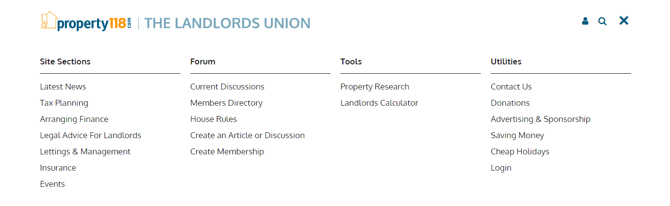
But full screen size
Member Since September 2013 - Comments: 374
1:59 PM, 7th August 2017, About 9 years ago
Reply to the comment left by Mark Alexander at 07/08/2017 – 13:16I use Firefox and almost always have several (numerous in fact) windows open simultaneously.
As a result of your comment I have just been back to check and my observation stands.
I can get THREE different results from clicking on the ‘View All Sections’ link in various different contexts.
1) traditional looking (for the most part) web page with all white background (including the Property118 banner) and a list of clickable options in a traditional “site map” style layout. Displayed page looks like an ordinary web page so the device-like ‘X’ to dismiss the modal is easily missed and, as reported earlier, the browser back button does not work as expected.
2) Also as reported after I wondered whether the design had been changed – I get a page with a blue background and section headers but no working links – indeed no list of links displayed at all, just the non-working section header links.
3) As (2) but with a full set of working links as expected.
It is going to drive you nuts when I say that I am not able to spare the time at the moment to work out exactly what is causing these various different behaviours. All I can say to you is that it is really happening and hope that the developers can take these clues and recreate at their end. The only thing that I can offer to add to this is that the phenomenon appears to be related to browser window size and even as to whether the browser window is displayed full-screen or not but at the moment this is only a stab in the dark guess as to what may be causing it I’m afraid.
Member Since September 2013 - Comments: 374
2:00 PM, 7th August 2017, About 9 years ago
Reply to the comment left by Mark Alexander at 07/08/2017 – 13:56Yes, that is what I get as my (1) above.
How can I post screenshots please?
Member Since July 2015 - Comments: 393
2:05 PM, 7th August 2017, About 9 years ago
Reply to the comment left by Mark Alexander at 13:56
Ah, That’s how it looks in Opera. I get Badgers’s 2) with a blue background in FF, but the links work (and the floating panel has a tendency to overlay the comment text unless I refresh the screen a few times, meaning that you can’t click reply. Web designers tend to have very high screen res and large screens and forget that some of us are visually challenged and need a lower res
Member Since January 2011 - Comments: 12230 - Articles: 1440
2:05 PM, 7th August 2017, About 9 years ago
Reply to the comment left by Badger at 07/08/2017 – 14:00It’s not easy to post screenshots unless you can use HTML.
We did have a plugin for this once but we took it out because it was causing conflicts and sadly, spammers and trolls were using it to publish all sorts of crap in image format which our spam software found difficult to detect.
Member Since September 2013 - Comments: 374
2:06 PM, 7th August 2017, About 9 years ago
Reply to the comment left by Mark Alexander at 07/08/2017 – 13:56The browser window size issue is (partly) confirmed.
Starting with a full-screen browser window displaying as per your screenshot it is sufficient to double-click the browser window title bar to get it to toggle to not full-screen and the displayed results convert to the “device” style listing with a blue background (as in my (3)).
(My (2) I leave as an exercise for the developers. Sorry. 🙂 )
Member Since July 2015 - Comments: 393
2:24 PM, 7th August 2017, About 9 years ago
Reply to the comment left by Badger at 07/08/2017 – 14:06It appears to be detecting viewport size (if you have fewer than x pixels, you must be using a phone, not be visually impaired on a PC), but for some reason does it differently on FF and Opera (so I can have it narrower in Opera than in FF), so when you get below a certain width, you get device-style (3). I suspect that sometimes the links don’t work as some of them are overlaying others, meaning that you are not actually clicking the link at all even though it looks as though you are. I’ve seen this on other websites. It’s a matter of getting the viewport width exactly right in order to reproduce it.
Member Since January 2011 - Comments: 12230 - Articles: 1440
2:30 PM, 7th August 2017, About 9 years ago
Reply to the comment left by Kathy Evans at 07/08/2017 – 14:24That makes perfect sense now Kathy, and I can now replicate what you are seeing on every browser I use.
The website does indeed detect pixel display to determine whether or not you are using a desktop browser or a mobile device. To my knowledge, that is how all mobile websites are configured so even though I now know what is causing the issue I have no idea how to make it any better. One for the clever folks at Accent Design (our web-developers) to ponder on I think!
Member Since July 2015 - Comments: 393
2:39 PM, 7th August 2017, About 9 years ago
Reply to the comment left by Mark Alexander at 07/08/2017 – 14:30Perhaps a check box somewhere to “always use desktop”? As you’ll find that increasing the text size in a window that previously worked as wide enough for desktop will switch it to mobile – and that’s an accessibility issue.
Member Since January 2011 - Comments: 12230 - Articles: 1440
2:48 PM, 7th August 2017, About 9 years ago
Hi Kathy
Presumably you are referring to using the “zoom” functionality on your PC to increase size?
You don’t need to do that on Property118. At the top of the article we provide visually impaired users with an opportunity to “Make text bigger”. If you use this functionality you don’t get the problem.